Who We Are & What We're About

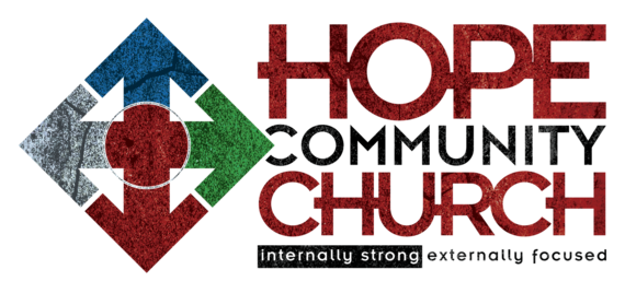
Our logo tells the story of who we are, what we value, and where we’re going. Hope's logo has been thoughtfully crafted and is loaded with symbolism:
- The interior circle represents the core of our being as people. It also pictures the interconnected relationships that we share together as a church.
- The cross (in red) represents the work of Christ, which is central to all we are and do. He and His work are the source of our internal strength.
- The four white arrows pointing to the center represent the need for each of us to be intentional at becoming internally strong at our core and our need to be connected to each other in community.
- The four colored, textured arrows pointing out from the center represent the expectation that each of us be externally focused all of the time
- Note the colors and textures: the colors represent the diversity of who we are as people. The textures represent the diverse culture in which we separately live.
- The two phrases “internally strong and externally focused” encapsulate our mission: Growing more like Jesus to live on mission all of the time.


